Sunday, August 25, 2024

Merry Christmas for The Paper Players

Hello friends!  It's time for a new challenge at The Paper Players and this time we have a sketch from the lovely Jaydee!  She is off this week, so I am filling in for her as hostess.  I hope you have fun with this one!


I am now feeling crunch time to start working on Christmas cards in earnest, and this sketch worked well with the image I wanted to use.


I used my new Pinkfresh Studio press plates to create the leaf and berry border as well as the senitment.  I used some cotton watercolor paper thinking I might try to use watercolor or colored pencils but on my trial piece I didn't like either, so I went to my go to Copic markers.  Because of the type of the paper, one must use a light hand when coloring or it will bleed.

I then die cut the sentiment and used partial die cutting so the die wouldn't cut the bottom edge of the border so I could have a larger panel to make sure the border was somewhat close to the middle.  On a separate panel of cardstock, I adhered the red glitter paper, then added the die cut panel, then adhered it all to an ivory card base.  My intention was to use the sketch as Jaydee created it, but when I started arranging the sentiment, I realized it looked so much better with the sketch flipped on its side.  A few green sparkly gems completed the card.


What are you inspired to create with this sketch?  We would love to see your card in the gallery this week!  Before you head off to your craftroom, please be sure to visit the challenge blog where my talented teammates have some more inspiration on how to use this sketch.  The challenge will remain open until 3 pm EDT on Friday 8/30.

Thanks for visiting and take care!

Stef

  • Pinkfresh Studio Magical Holiday Pressplates and Dies
  • Spellbinders Betterpress Cotton card panel
  • Altenew Brilliant Red Glitter cardstock
  • Picket Fence Studios Candy Lane Gem Mix

Sunday, August 18, 2024

Cheers for The Paper Players

Hello friends!  Today we have a fun new challenge at The Paper Players.  The amazing Claire is hosting our CAS challenge and is asking us to use fruit on our cards.

I decided to make a very vibrant card to share, which seemed fitting for summertime.


The glass and fruit were all foiled in gold using a pressplate, colored with Copic and Olo markers then die cut with the coordinating die.  The stamp set and pressplate create all the images at once and then there is only one die to cut it all out, which I love since it's all done in one pass.  

After I had all the elements colored, I ink blended the front of a white card base with super vibrant colors, then let that dry as I gold heat embossed the Cheers sentiment and stamped out the sub sentiment.  When I started to assemble the card, it just seemed to need a bit something more, so I added the foiled and die cut frame directly to the edge of the card, then added everything else.  Some things were adhered directly to the card front and some elevated with a bit of foam tape, but I made sure to leave lots of "white" space.  I love the bright colors and the festive, fruity elements!


Thanks for taking time to stop by and I hope that you'll join us this week!  My talented teammates have some amazing inspiration for you over on the challenge blog, so please be sure to stop by and take a look.

Take care!

Stef

  • Pinkfresh Studio Cheers Stamp, Dies and Pressplate
  • Pinkfresh Studio Decorate Frames Pressplate and Die
  • MFT Skinny Strips sentiment lable die
  • Simon Says Stamp Peony, Sherbet and Lemonad inks and Ultra Fine Gold embossing powder
  • Olo markers:  RV1.7, 1.5, 1.3, YG1.6, 1.4, 1.2, G1.5, 1.4, 0.1
  • Copic markers: Y26, 38, 08, 04, 00, R39, 37, 35, YR09, 16, B000, 0000

Friday, August 16, 2024

Summertime Silhouette for Color Hues

Hello friends!  We have a new, beautiful color combination for your inspiration at Color Hues.  This time the amazing Tracey has chosen something I think is perfect for summer, yellow and orange.

To me, these colors say either a beautiful summer sunrise or sunset, although fruit would be an equally good choice.  But I chose I sky scene.


I used an older Simon Says Stamp/CZ Design stamp set with these gorgeous colors to create a little summery scene.  Starting with the silhouette image, it was stamped with black pigment ink on a panel of Koh-I-Noor Bristol paper, then I ink blended a few Distress inks to create the background.  I put the paper back in my Misti and stamped a second time to darken the silhouette.

Because the stamp is narrow, a mini slimline seemed most appropriate, so the panel was trimmed down.  It was at this point that I decided to add some new Distress Spritz sprays in Spiced Marmalade and Fossilized Amber.  I add some light spray and also did a bit of splattering then set it aside to dry.  The sentiment from the same stamp set was white heat embossed on black and die cut along with two butterfly dies, also from the same set. The dried panel was added to the black card base, then the sentiment and butterflies were adhered with some foam tape.  To complete the look, three tiny gems were added to each butterfly.  My only regret is not restamping the silhouette image after the spray dried, but I tell you, in real life all the shimmer and sparkle don't really diminish the silhouette like the photo does.


This is such a great color combo, I hope you're inspired to create along with us!  I know you'll love to see what my very talented teammates have created, so head over to the challenge blog before heading to your craft room!  The challenge will remain open until 9 a.m. Thursday August 29th.

Thanks for visiting.  Take care!

Stef
  • Simon Says Stamp Silhouette Sentiments Stamps and Dies
  • Squeezed Lemonade, Mustard Seed, Spiced Marmalade and Wild Honey Distress inks
  • Spiced Marmalade and Fossilized Amber Distress Spritz sprays
  • Spellbinders Aura Color Essential Gems

Thursday, August 15, 2024

Sulfur Cosmos for The Flower Challenge

Hello friends!  I'm here with my mid-month reminder card for The Flower Challenge.  This month we are using the beautiful mood board colors, of which you need to use at least three with your floral card.

 
Last time I used the pink, coral and sage, so for this card I went with peach, sage and gray.


I fell in love with these Sulfur Cosmos blooms and stencils from Altenew.  Along with stencils to color the flowers, it also included the pattern in the background of my card, which I created using paste on a gray panel.  The flowers were stenciled with soft peach and sage inks, then die cut with the coordinating die.  I did fussy cut the space between the upper and lower flowers because I didn't care for the big section of white against the gray panel.  I also went in with a few Copic markers to enhance the shading and create more dimension.  

After adding the floral image to the gray panel, the overhanging parts were trimmed off then it was adhered directly to the front of a white cardbase.  The sentiment, also from the same stamp set, was stamped, die cut and added to the card front.  To complete things, I added three iridescent drops around the sentiment.


Thanks so much for stopping by.  I encourage you to use the link above to be inspired by the beautiful cards by my amazing teammates and hopefully join us!  There's still plenty of time; the challenge will remain open until Sunday, August 25th.

Take care!

Stef

  • Altenew Sulfur Cosmos Stamps, Stencils and Dies
  • Hero Arts White Pearl paste
  • Altenew Orange Sorbet, Pastel Sunrise, Canyon Clay, Peachy Glow, Golden Honeycomb, Silver Sage, Jade and Eucalyptus dye inks
  • Copic markers
  • Pinkfresh Studio Iridescent Clear Drops


So Sweet for Time Out Challenges

Hello friends!  I'm so very pleased to be the Guest Designer at Time Out Challenges #270 for the next two weeks!  They have a wonderful photo to inspire in so many ways.


I was literally inspired by the berries and in retrospect, wish I had used a heart too.


Just prior to being asked to GD, I purchased the cute House-Mouse Berry Good stamp, so it was a perfect match.  The image (which is bigger than you see here - more on than in a minute) was stamped then colored with Copic and Olo markers. I had trimmed it down to a rectangle and was getting ready to put together my card when I dropped an ink pad on a portion of the colored image!  AAWWWKK.  I'd had a hold of the lid, thinking it was secure but nope, it wasn't.  So I went to Plan B.

I was inspired by a card on the Spellbinders website (where they now sell the House-Mouse products) that spotlighted a portion of the image in a circle, so that is what I did.  I had a white woodgrain panel already trimmed down with a rounded rectangle die, so I used a circle die to cut a hole then layered the colored panel beneath.  Here is where I wish I'd used a heart rather than a circle but, you know, hindsight.  Everything was added to a plum card base, then I decided to create a frame around the window and that really made things pop.  Last came the sentiment which is also from the same stamp set.


Thanks for taking time to stop by and I encourage you to check out the challenge, where the DT have fabulous cards to further inspire you plus there are prizes to be won if you play along!

Take care!

Stef

  • Spellbinders House-Mouse Designs stamp set
  • Hero Arts Infinity Circle and Rounded Rectangle dies
  • Copics:  Sky - B00, 000, 0000; Berries - RV69, 66, 55, 52; Basket - W5, 3, 1, 0; Mice - E37, 35, 33, 31, 30; Leaves - G29, 21, YG45
  • Olos - Grass - YG 1.6, 1.4, 1.2

Sunday, August 11, 2024

Divine Peony for The Paper Players

Hello friends!  It's a color challenge this week at The Paper Players and this time the lovely Jan has chosen a soft color combination of Lemon Lolly, Flirty Flamingo and Soft Sea Foam and one neutral.


I'm also joining the current challenge at Addicted to Stamps and More.


I had an as yet unused die set that seemed like the perfect match for this colors.


Do you start your card making with a plan?  I usually don't have more than a rough idea and start with the focal image and go from there.  For this card, it was the flower and leaves, which were die cut from white cardstock then ink blended with colors similar to the SU ones.  I started with pink in the flower centers, fading it out to white then coming in from the edge with a light yellow.  My neutral is the brown center.  The leaves on the left are from the same die set as the flower and the two on the right from a separate die set.

I settled on the Ornate Nesting die for the center piece, which was cut 3 times from white cardstock, inked with the same pink, then the flowers and leaves adhered to it.  A white panel was embossed with the leaf 3D folder, trimmed down to A2 size and adhered to the card base.  The two addition Ornate Nesting die cuts were adhered under the main image for a small bit of dimension then added to the card front.  

For the sentiment I found one that fit from a press plate set, but all of the ones I'd previously made were either foiled or in black ink, which didn't look right, so I ended up making one using the same brown used for the flower center and I liked that so much better.


We would love to see your card in the gallery this week!  My talented teammates have loads of inspiration for you over on the blog, so I hope you'll take a moment to visit, then head to your crafty space and play along with us!  The challenge will remain open until noon PDT Friday August 16th.

Take care!

Stef
  • Simon Says Stamp Divine Peony and Lush Leaves dies
  • Altenew Orante Nesting die
  • Spellbinders A Little Message Betterpress Sentiment & Die set and Leafy 3D embossing folder
  • Altenew Frosty Pink, Coral Berry, Lemon Ice, Pistachio, Misty Sage and Rhodolite ink.

Sunday, August 4, 2024

Framed Hibiscus for The Flower Challenge

Hello friends! It's a new month and time for a new theme at The Flower Challenge.  For August, we have a color challenge (you must use at least 3 of the colors), and it is a beauty for all types of summer florals.

I'm still not over being enamored with embossing folders and this time I used the matching stencil set.


The embossed image is about 5" x 5" but I ended up trimming it down to fit an A2 sized card.  I used the stencil to color the large flowers in coral tones and the petite blooms in more of a peachy-pink color.  There are two types of leaves so they were colored with two sage-like ink families.  I used a brown for the hibiscus stamen and then added the white with a gel pen.

The embossed panel was matted on a slightly larger one in light peach, then added to an ivory card base using a few layers of scrap cardstock for a small amount of dimension.  It seemed to be missing something so I decided to add a frame cut from Brushed Rose cardstock.  At this point I was satisfied with the design and decided not to add a sentiment or embellishments, which I can include later when it is sent.


I hope these colors inspire you to join us this month and to further generate your creative juices, please visit the challenge blog and see how my wonderfully talented teammates used these colors!  The challenge will remain open until Sunday August 25th.

Thanks for visiting.  Take care!

Stef

  • Altenew Sun-Kissed Blooms 3D embossing folder and layering stencils
  • Simon Says Stamp A2 Nesting Frames
  • Altenew Brushed Rose cardstock
  • Concord and 9th Nectar cardstock
  • Altenew Fresh Dye inks in Blush, Rouge, Rhodolite, Silver Sage, Jade and Eucalyptus
  • Altenew Crisp Dye inks in Coral Bliss and Heart Beat
  • SSS inks in Aspen, Sage and Pine
  • Sakura White Gelly Roll pen


Beach Time for The Paper Players

Hello friends!  Today at The Paper Players we have an appropriate theme - Beach Time!  I'm hosting this week and would love to see your beautiful cards depicting time at the beach.


I'm also playing along with Time Out Challenges and their words of inspiration "It's always summer somewhere"

I love the beach on the Oregon Coast, where I've spent lots of time, but today my card has a more tropical vibe and I would love to spend time on this beach too!


Isn't that little beach house the cutest?  It's one of three beach houses included in Honey Bee Stamp's Lovely Layers: Beach House die set. It also includes to two smaller palm trees; the larger one is from the Lovely Layers: Hammock set.

To start, every piece was die cut from white cardstock, then I used my Copic and Olo markers to color everything.  It's a bit more work but I find I get more texture in things such as the palm trunks and fronds.  Plus, many of the pieces are so small I find it easier to color than ink blend.  With the coloring complete, everything was assembled and I moved onto the background.

I kept the background very simple to keep the focus on the die cut images, just ink blending what might be perhaps a little lagoon away from the main beach, then adding the sand and the sky. I used a white gel pen to create the gentle waves and add a bit of detail to the flag.  The sentiment was stamped and then the scene was created.  I had created a second beach house but the scene just seemed to busy to I will hold onto it for another card, maybe on a 5" x 7" size - this one is 6" x 4.5".


So what do you enjoy when you're at the beach?  We would love to have you share your beach-y themed card this week.  The challenge stays open until noon Friday 8/9.  In the meantime, my teammates have some fabulous cards to inspire you at the challenge blog, so I encourage you to pop over and take a look.

Also, if check back later, I'll have a second post with my card for The Flower Challenge.

Take care!

Stef
  • Honey Bee Stamps Lovely Layers: Beach House and Lovely Layers: Hammock
  • HB Sunkissed Summer Stamp Set
  • Altenew Sea Glass, Sea Breeze and Turquoise inks
  • Simon Says Stap Latte Ink
  • Sakura White Gelly Roll pen
  • Olo markers - R2.4, 2.2
  • Copic markers - BG07, E75, 55, 37, 33, 31, 30 YR23, Y13

Thursday, August 1, 2024

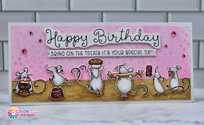
Bring On the Treats for Color Hues

Hello friends!  Welcome to August and to the latest Color Hues challenge!  This time I am your hostess and have chosen pink and brown as our hues of color.

I'm also sharing my card over at Addicted to Stamps, where the current theme is "Birthdays".


I had fun making a "sweet" slimline birthday card with cute mice!  


Yes, we have some mice bringing treats for the birthday party!  The first step was to find ink and Copic marker colors that went well together.  Once that was done, the background was ink blended with pink and brown, then I went over the pink with a polka dot stencil.  I varied my inking pressure to create a non-uniform look.  I then splattered the stenciled portion of the background with white iridescent shimmer spray using a paint brush reserved specifically for that task.

Next, all the mice were stamped, colored and die cut.  I used gray for the mice so they would stand out from the background and used various light and dark pinks and browns for the treats.  After stamping the sentiments, the sub-sentiment was cut out with a label die and I fussy cut the happy birthday to give it a fun look.  

The card was assembled with the three middle mice popped up on foam tape, as well as both sentiments.  I used a brown marker to darken the "ground" as it was too light with just the ink blending.  I then colored over the white borders of the die cut images with a brown and pink marker so the die cuts would blend into the background.  I have mixed feelings about doing that; I think next time I would stamp and mask where necessary rather than add die cuts.  But all in all, it still turned out as cute as I'd hoped.  Pink gems were added and an aqua shimmer pen was painted on all the confections for a bit more sparkle.


What are you inspired to create with these colors?  My super talented teammates have a bevy of fabulous cards that will spark your creativity, so be sure to visit the challenge blog before heading off to your crafty space!  The challenge will remain open until 9am EDT Wednesday August 14th.  Hope to see your card in the gallery!

Take care!

Stef

  • Colorado Craft Company/Anita Jeram So Sweet Slimline stamps and dies
  • Simon Says Stamp Slimline Borders Stencil
  • MFT Slimline Skinny Strips die
  • SSS Latte ink
  • Altenew Baby Pink ink
  • Altenew Pink Tourmaline Gem Sparkles
  • Hero Arts White Iridescent Shimmer Mist
  • Tonic Aqua Shimmer pen
  • Sakura White Gelly Roll pen
  • Copics:  E59, 57, 53, 37, 35, 33, 31, 30, RV06, 04, 02, 10, T2, 0